
Squarespace: How to Place and Name Calls to Action on Pages
- Oct 2, 2025
- 8 min read
Transform Visitors into Customers with Strategic, Well-Designed Calls to Action
Welcome to your comprehensive guide on creating and placing effective calls to action (CTAs) on your Squarespace website! One of Squarespace's greatest strengths is how beautifully it presents calls to action – with professional button designs, strategic placement options, and seamless integration with your site's overall aesthetic. Whether you're encouraging visitors to book a consultation, download a guide, or make a purchase, well-crafted CTAs are the bridge between browsing and buying. In this guide, we'll show you how to leverage Squarespace's design capabilities to create compelling calls to action that not only look professional but also drive real business results.
Understanding Calls to Action - Your Website's Most Important Business Tool
Think of a call to action (CTA) as your website's friendly guide that tells visitors exactly what you'd like them to do next. Just as a helpful shop assistant might say "Would you like to try this on?" or "Shall I show you our latest collection?", a call to action on your website gently encourages visitors to take the next step in their journey with your business. These might be buttons that say "Get Your Free Quote", "Book a Consultation", "Download Our Guide", or "Contact Us Today".
Without clear calls to action, your website visitors are like customers wandering around a shop with no assistance—they might browse and leave without ever knowing how to actually work with you or buy from you. Every page on your website should have at least one clear call to action that guides visitors towards becoming customers or staying connected with your business.
The beauty of well-placed calls to action is that they transform your website from a digital brochure into a powerful business tool that works for you around the clock. When someone visits your website at 2 AM on a Sunday (which happens more often than you might think!), a clear call to action allows them to take immediate action—whether that's booking an appointment, requesting information, or making a purchase—even when you're fast asleep. The key is making these actions feel natural and helpful rather than pushy or sales-focused. For example, if someone has just read your blog post about "10 Signs Your Website Needs Updating", a relevant call to action might be "Get Your Free Website Health Check" rather than a generic "Buy Our Services". This approach feels helpful because you're offering a logical next step that directly relates to what they've just learned about.
Creating effective calls to action isn't about being clever or creative—it's about being clear, helpful, and making it incredibly easy for people to take the next step with your business. The most successful calls to action use simple, action-oriented language that tells people exactly what will happen when they click. Instead of vague phrases like "Learn More" or "Click Here", effective CTAs are specific: "Download Your Free Checklist", "Schedule Your 15-Minute Discovery Call", or "Get Your Instant Quote". Remember, your website visitors are busy people who are often browsing on their phones whilst juggling other tasks. They need to understand immediately what you're offering and why it's valuable to them. When you make it crystal clear what action you want them to take and what benefit they'll receive, you'll be amazed at how many more people actually follow through and become customers or enquirers.
Squarespace's CTA Advantages
Before diving into the technical steps, it's important to understand why Squarespace excels at calls to action:
Professional Design Templates: Every Squarespace template includes beautifully designed button styles that look professional and trustworthy.
Mobile-Optimised CTAs: All buttons and forms automatically adapt to mobile devices, ensuring your CTAs work perfectly on smartphones and tablets.
Integrated Analytics: Track CTA performance with built-in analytics to see which calls to action drive the most conversions.
Seamless Form Integration: Connect CTAs to contact forms, newsletter signups, and e-commerce functionality without any technical complexity.
A/B Testing Capabilities: Test different CTA designs and placements to optimise performance over time.
Types of Calls to Action and Their Strategic Uses
Primary CTAs - Your Main Business Goals
These are the most important actions you want visitors to take:
"Book a Consultation" – Service businesses
"Get a Free Quote" – Contractors and agencies
"Shop Now" – E-commerce businesses
"Start Your Free Trial" – Software and subscription services
Secondary CTAs - Nurturing and Engagement
These help build relationships with visitors who aren't ready for your primary CTA:
"Download Our Free Guide" – Lead generation
"Subscribe to Our Newsletter" – Ongoing engagement
"Follow Us on Social Media" – Community building
"Read Customer Reviews" – Trust building
Micro CTAs - Small Steps Forward
These encourage smaller commitments that lead to bigger ones:
"Learn More About Our Process" – Education
"View Our Portfolio" – Showcasing work
"See Pricing Options" – Transparency
"Contact Us for Questions" – Support
Step-by-Step Guide to Creating Effective CTAs
Step 1: Planning Your CTA Strategy
Identify Your Primary Goal:Before creating any CTAs, determine what action is most valuable for your business:
Service Businesses: Usually booking consultations or requesting quotes
E-commerce: Making purchases or joining email lists
Content Creators: Newsletter signups or social media follows
B2B Companies: Demo requests or whitepaper downloads
Map CTAs to Customer Journey:
Awareness Stage: Educational content downloads, newsletter signups
Consideration Stage: Free consultations, product demos, case studies
Decision Stage: Purchase buttons, booking forms, contact requests
Step 2: Creating Button CTAs in Squarespace
Adding Button Blocks:
In the Squarespace editor, click + Add Block where you want to add a CTA

Select Button from the content blocks

Choose your button style (your template will have pre-designed options)
Configuring Button Settings:
Double click on your button to bring up the button settings. Button Text: Write clear, action-oriented text
Good Examples: "Book Your Free Consultation", "Download the Guide", "Get Started Today"
Poor Examples: "Click Here", "Learn More", "Submit"


Button Link: Choose where the button leads:
Page: Link to another page on your site
URL: Link to external sites or booking systems
Email: Open email client with pre-filled address
Phone: Enable click-to-call on mobile devices
File: Link to downloadable files

Button Design Customisation:
The design of your buttons has been designed to fit with the overall site so unless you have specifc reasons to change it we recommend you stick to the provided design from Squarespace. If you do want to click on the button then you can edit the design of your Primary, Secondary and Tertiary buttons.

Step 3: Strategic CTA Placement
Above the Fold Placement:
Place your most important CTA where visitors can see it immediately:
Homepage hero section (at the top): Your primary business CTA
Service pages: Relevant action for that specific service
About page: Contact or consultation CTAs
Throughout Page Content:
For longer content, place CTAs strategically:
After problem identification: Offer solutions
After explaining benefits: Provide next steps
At natural conclusion points: Summarise and direct action
Exit-Intent Placement:
Catch visitors before they leave:
Footer CTAs: Newsletter signups, social media follows
Sidebar CTAs: Related services or content
End of blog posts: Relevant next actions
Step 4: Creating Form-Based CTAs
Contact Form CTAs:
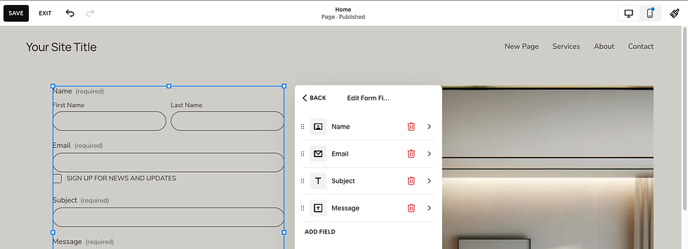
Add a Form block to your page ( Click + Add Block) and add a Form.
Customise form fields for your specific needs by clicking on the form then Edit Form Fields
Name and Email: Essential for follow-up
Phone Number: For urgent enquiries
Service Interest: To qualify leads
Message: For specific questions or requirements
Form Optimisation:
Form Settings.
In Form settings click on Post-Submit. Pick if it is a message or Redirect to another link
In Storage define where the form goes to - Notification by Email, Additional Storage where you can catch the data once connected. We recommend Google reCAPTCHA is on to protect the integrity and security of your site.
Once completed you can see the form submissions in the site here:

CTA Copy and Messaging Best Practices
Action-Oriented Language
Use Strong Action Verbs:
Get, Download, Start, Book, Join, Discover, Unlock, Access
Examples: "Get Your Free Quote", "Start Your Journey", "Unlock Exclusive Content"
Create Urgency (When Appropriate):
"Book Your Consultation Today"
"Download Now - Limited Time"
"Join 1000+ Happy Customers
Value-Focused Messaging
Highlight Benefits, Not Features:
Poor: "Submit Form"
Better: "Get Your Custom Quote"
Best: "Get Your Free, No-Obligation Quote in 24 Hours"
Address Customer Concerns:
"Free Consultation - No Commitment Required"
"Instant Download - No Spam, Ever"
"Secure Checkout - Your Data is Protected"
Personalisation and Relevance
Match CTAs to Page Content:
Blog about SEO: "Get Your Free SEO Audit"
Service page about web design: "See Our Design Portfolio"
About page: "Meet Our Team" or "Start Your Project"
Use Inclusive Language:
"Join Our Community" instead of "Subscribe"
"Get Your Guide" instead of "Download PDF"
"Start Your Journey" instead of "Sign Up"
Measuring and Optimising CTA Performance
Analytics and Tracking
Squarespace Analytics:
You can track Form & Button Conversions

Google Analytics Integration:
Set up Goals in Google Analytics to track:
Form submissions
Button clicks
Page visits after CTA clicks
E-commerce conversions
A/B Testing CTAs
Elements to Test:
Button Text: "Get Quote" vs "Free Consultation"
Button Colours: Contrasting vs brand colours
Placement: Above fold vs throughout content
Size: Large vs medium buttons
Messaging: Benefit-focused vs action-focused
Testing Process:
Choose One Element: Test one variable at a time
Set Testing Period: Run tests for at least 2-4 weeks
Monitor Results: Track click-through rates and conversions
Implement Winners: Apply successful variations site-wide
Industry-Specific CTA Strategies
Service-Based Businesses
Professional Services (Lawyers, Accountants, Consultants):
Primary: "Schedule Your Free Consultation"
Secondary: "Download Our Service Guide"
Trust-Building: "Read Client Success Stories"
Health and Wellness (Doctors, Therapists, Fitness):
Primary: "Book Your Appointment"
Secondary: "Take Our Health Assessment"
Educational: "Access Our Wellness Resources"
E-commerce Businesses
Fashion and Retail:
Primary: "Shop the Collection"
Secondary: "Join Our Style Community"
Urgency: "Limited Stock - Order Now"
Food and Beverage:
Primary: "Order Online"
Secondary: "View Our Menu"
Local: "Find Your Nearest Location"
Creative Professionals
Photographers and Artists:
Primary: "Book Your Session"
Secondary: "View Our Portfolio"
Social: "Follow Our Latest Work"
Designers and Agencies:
Primary: "Start Your Project"
Secondary: "See Our Case Studies"
Educational: "Download Our Design Guide"
Troubleshooting Common CTA Issues
Problem: Low Click-Through RatesPossible Solutions:
Make CTAs more prominent: Use contrasting colours and larger sizes
Improve copy: Focus on benefits rather than features
Test placement: Try different positions on the page
Reduce friction: Simplify forms and processes
Problem: High Clicks, Low ConversionsPossible Solutions:
Align expectations: Ensure CTA text matches the destination page
Improve landing pages: Optimise the pages CTAs lead to
Reduce form fields: Only ask for essential information
Add trust signals: Include testimonials, security badges, guarantees
Problem: CTAs Not Visible on MobilePossible Solutions:
Test mobile display: Preview your site on various devices
Increase button size: Ensure buttons are easily tappable
Improve contrast: Make sure CTAs stand out on small screens
Simplify navigation: Reduce clutter around CTAs
Advanced CTA Optimisation Techniques
Psychological Triggers
Social Proof:
"Join 5,000+ Happy Customers"
"Trusted by Leading Brands"
"See Why Clients Choose Us"
Scarcity and Urgency:
"Limited Spots Available"
"Offer Ends Friday"
"Only 3 Left in Stock"
Risk Reversal:
"30-Day Money-Back Guarantee"
"Free Trial - Cancel Anytime"
"No Commitment Required"
Seasonal and Contextual CTAs
Holiday Promotions:
"Christmas Sale - 40% Off Everything"
"New Year, New Website - Get Started"
"Summer Special - Book Now"
Industry Events:
"Conference Special - Save 25%"
"End of Financial Year - Act Now"
"Back to School Offers"
Key Takeaways for CTA Success
Clarity is King: The most effective CTAs are crystal clear about what will happen when someone clicks. Avoid clever wordplay in favour of straightforward, benefit-focused language.
Design for Mobile: Most of your visitors will see your CTAs on mobile devices. Ensure buttons are large enough to tap easily and text is readable on small screens.
Test and Optimise: What works for one business might not work for another. Regularly test different CTA approaches and implement what works best for your audience.
Match Intent to Action: Align your CTAs with where visitors are in their customer
journey. Don't ask for a sale when someone is just learning about your services.
Reduce Friction: Make it as easy as possible for people to take action. Minimise form fields, provide clear next steps, and remove any barriers to conversion.
Build Trust: Include trust signals like guarantees, testimonials, and security badges near your CTAs to increase confidence in taking action.
Comments